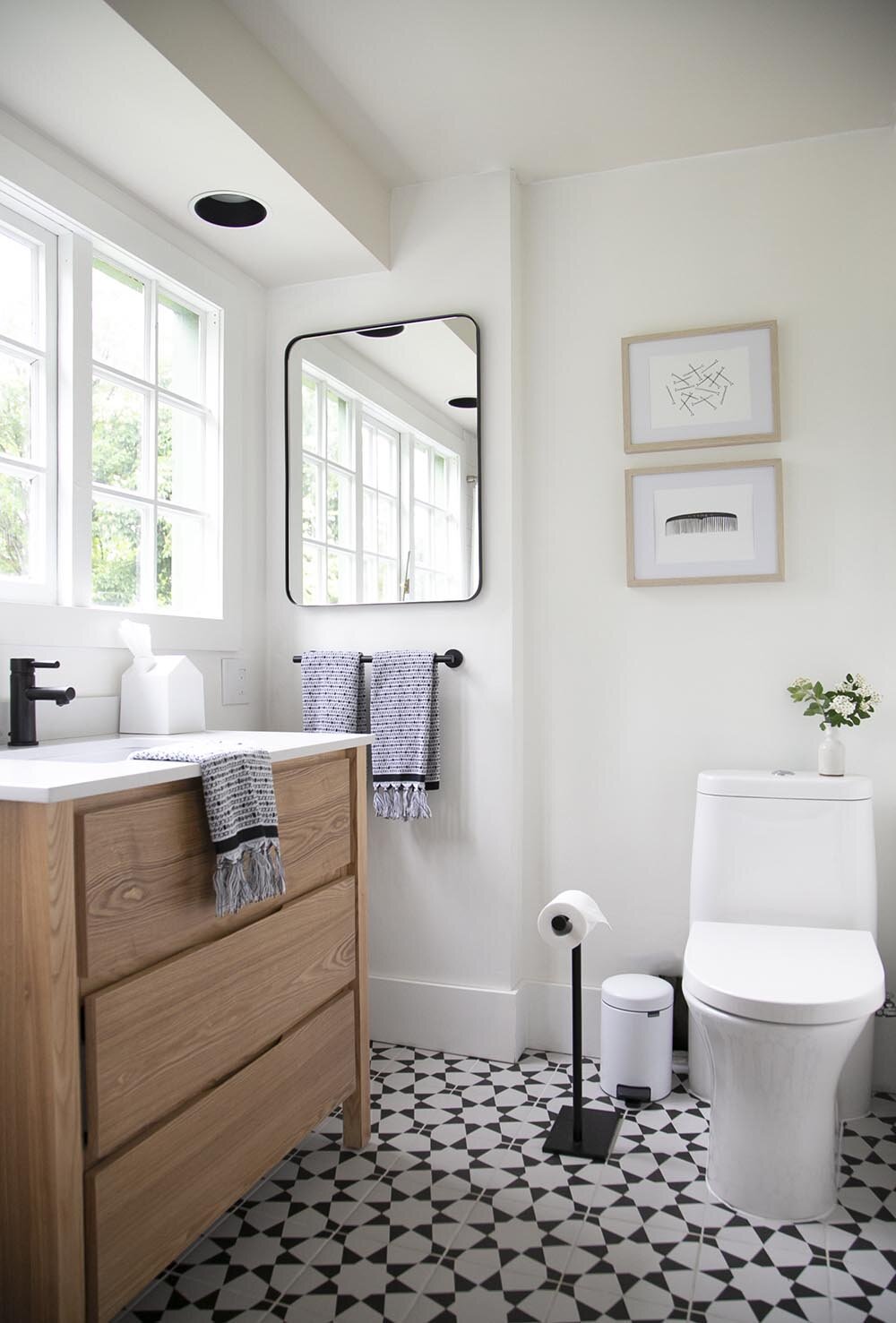
From the moment we saw this house, we knew we needed to make a change to the kids bathroom for the house to truly be functional for our family. I’m so excited to say that today is the day I get to share the new bathroom and the first bathroom I’ve ever designed with you all! The kids’ bathroom from our rental house #3 is FINALLY finished!
If you haven’t, go back and see where we started and if you’re on Instagram, head to my highlights to see the process from start to finish (trust me, it’s worth it!).
The intention for this space was to create a bright, airy and CLEAN bathroom and maximize the small space that we were working with. By removing the door and adding a barn door (see below), we were able to use the entire footprint of the bathroom.
You can see that we used a simple white subway tile on shower walls, and decided to have them tiled in a basketweave pattern to add something a little bit unique. Keeping in mind that this is a rental house, the floor tile was chosen mainly because of price point, but I love how the fun pattern turned out so much! You can find it here!
Since this bathroom is on the smaller side, using every last inch for functionality was essential. While I wasn’t sure how to approach the windows above the vanity (do we put a mirror over top?), I decided that it would be most practical if the kids could walk up to the mirror to look into it and there is enough space next to the vanity to do that. Bathroom art is hard! I chose these art prints for a bit of playfulness and also because they blend so naturally into the colour scheme.
In searching for bathroom ideas, a few things seemed pretty difficult to find. For good reason, not too many people share their toilets in photos, but I wanted to show this here as we really needed to use a workaround. It’s also fairly unusual to have windows directly above the vanity, and while I love the light that comes in here, we still may add frosting for added privacy.
Here you can see the before and after of the same shot! If nothing else, this shot shows how much more open the bathroom entryway is now and how by adding a barn door, the entry into the shower is open and accessible - a true essential for safely bathing kids!
I know this post took a while to come! It’s amazing how quickly some parts go (the tile, as we had this professionally installed) and how slow other parts went (finding all of the accessories). I hope you have enjoyed a glimpse into our newest home; I’d love to hear your thoughts in the comments!
In case you missed the introduction to our bathroom and want to see more of the before photos, you can find the post about where we started and the plan of the bathroom here.
Here are all of the sources for you too. Thank you so much for cheering me on with this bathroom project and always being so invested in our rental house makeovers.
Wall colour: Benjamin Moore Chantilly Lace (eggshell)
Trim colour: Benjamin Moore Chantilly Lace (semi-gloss)
Bath mat was H&M (no longer available)


