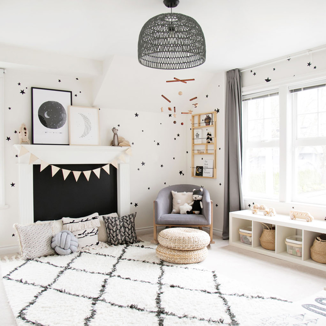
RENTAL HOUSE: OUR TWIN GIRLS' SHARED ROOM!
Well, here we are…the second room reveal of the rental house!!! If you caught the before photo in last week’s post of this space, you’ll remember that one twin wasn’t too thrilled about moving into that room. I’m happy to report that with a little re-decoration, both girls now love this space!
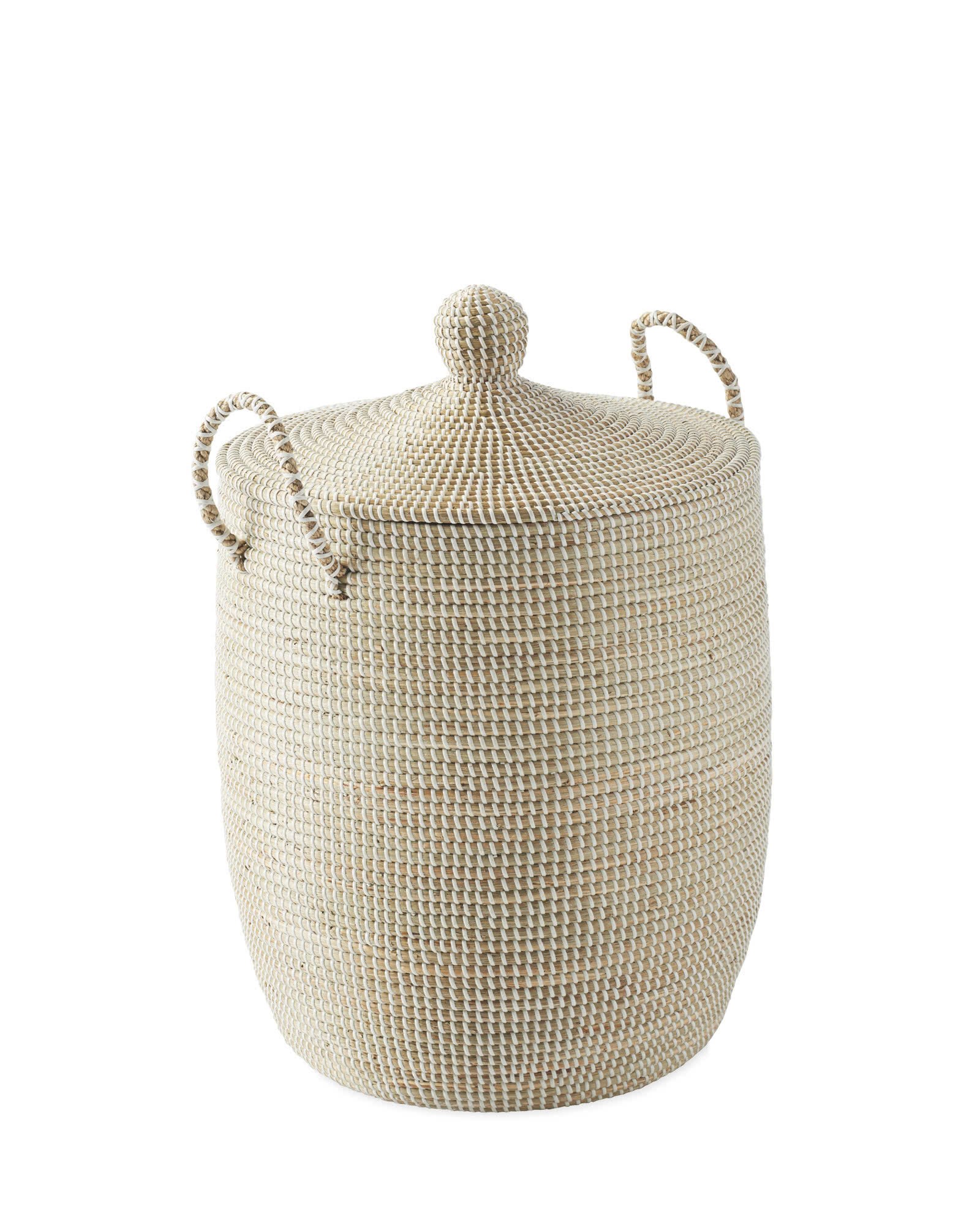
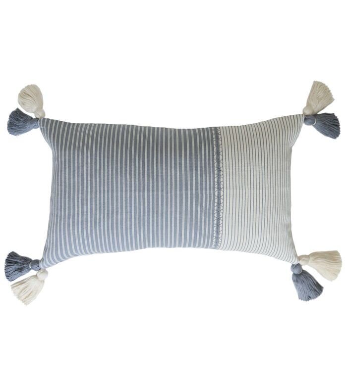
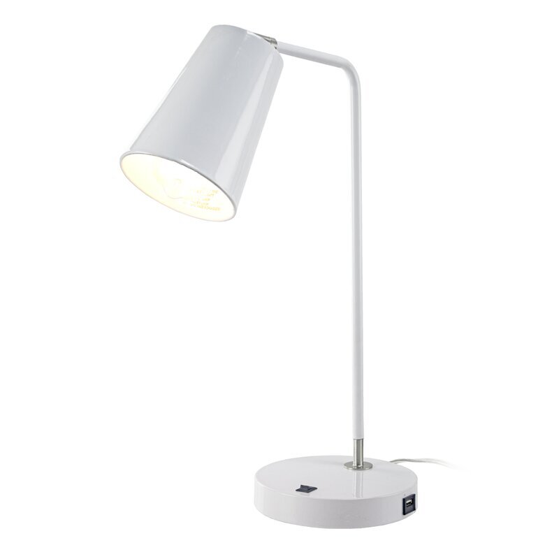
SHOP THE LOOK…
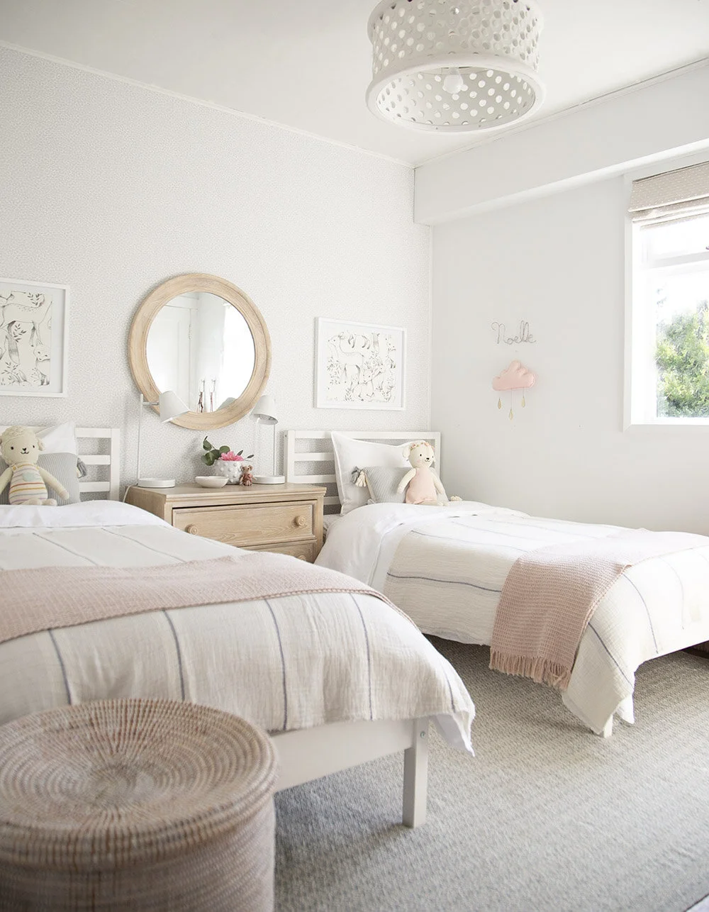
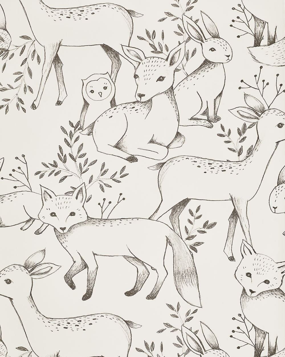
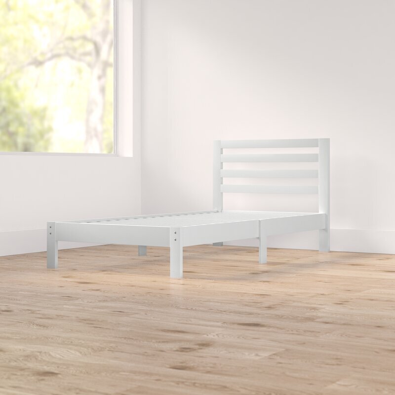
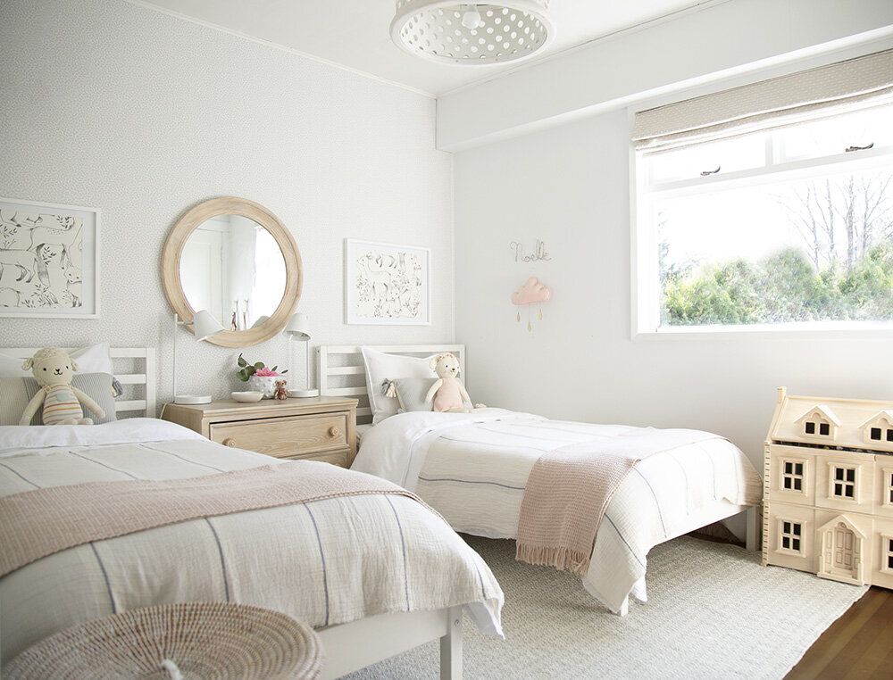
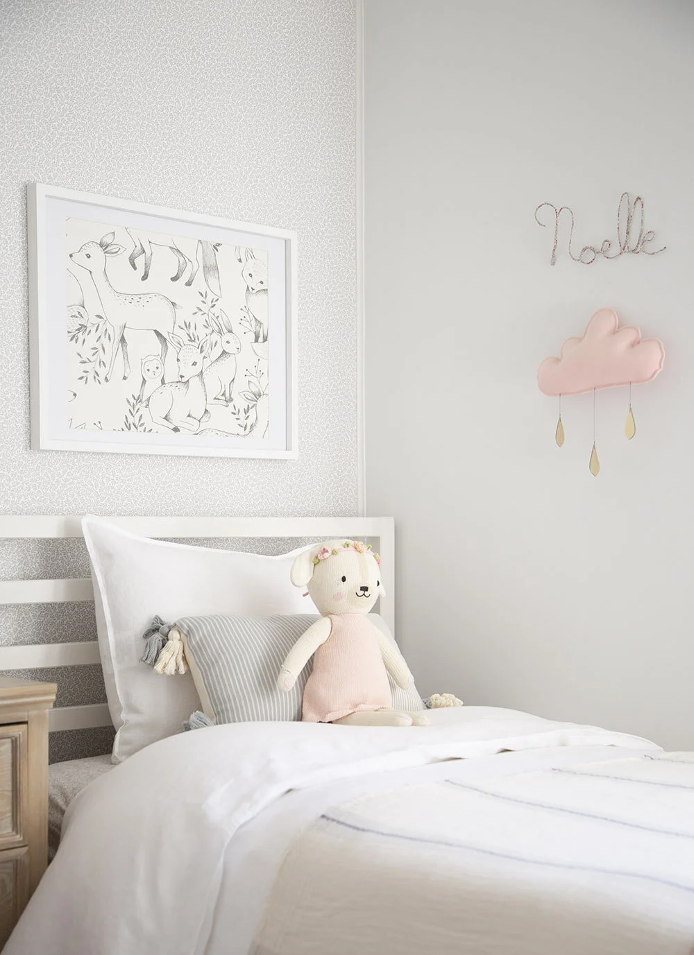
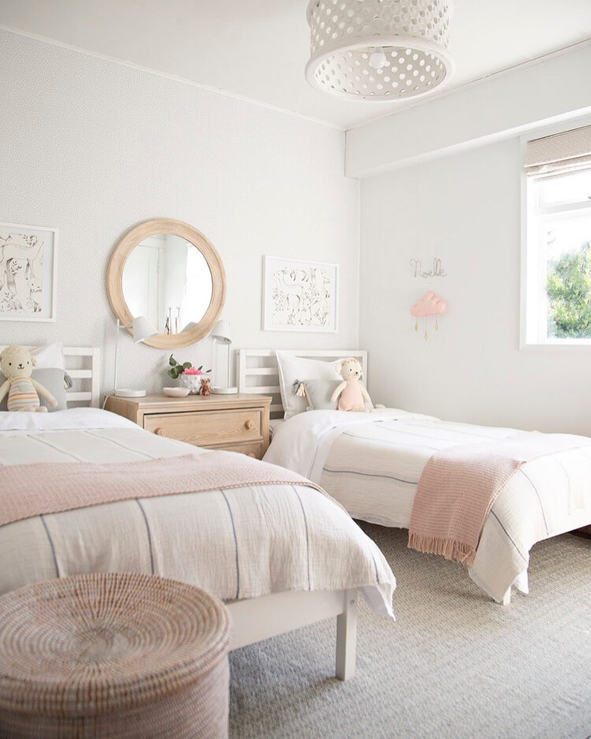
What started with a super basic room (and still is) has turned into a pretty and fresh space for my sweet girlies to make their own memories in. As with so many before and afters, a fresh coat of paint was a big help. I hesitated in sharing this room because the beds didn’t feel right. We have had these Ikea wood beds for a while now, waiting until we move into a permanent house where we could transition the girls into bigger, more substantial beds. It didn’t seem worth buying interim ones for this rental house, so we just painted them white and kept them as is. The pictures in the frames have been swapped out a few times, but the girls love these forest animals, so this is where we’ve landed for now.
After a full coat of paint, then adding a wall of wallpaper, the focus turned to finding enough space for a little storage. This dresser is more traditional than my typical style, but it was the exact fit for a functional side table and clothes keeper between the beds. I just love how the simple round mirror pulls the big wall together. The sweetest little lamb and bunny are from Cuddle + Kind, one of my favourite Canadian companies, who donate 10 meals to kids in need for every doll purchased.
You might have spotted these bookshelves before in the post about how to style your kids’ shelves. I still love the simplicity of these white metal shelves and recommend them for storing books and pretty things anywhere in your house.
In this next photo, you can see the window side of the room. This is South facing and lets in a lot of light! While I typically wouldn’t add custom shades to a rental, it was an absolute need to have blackout for this window. I just LOVE how these turned out and really feel that this fabric gives the space a little bit of a special feel. They are from Tonic Living, who were a joy to work with. You can also find the rug here.
The wood dollhouse is on my gift list each year and has been a firm favourite with our girls for a few years now. It is a big hit with play dates and I’m always amazed by how long our two girls play with it independently. The hooks are old from Anthropologie and the purses are from a trip to Australia. Above right are my sweet girls who I am so lucky to have been able to decorate this room for! Credit for this image goes to my patient husband who took the kids out of the house during quarantine so that I could shoot the room and then came back and snapped this photo for us.
In case anyone thought that their room looks like this all the time, please know that a styled shoot is just that! The second they walked in the door, the girls were up and jumping on their beds as usual and soon enough, the trinkets will be back on their dresser and shelves. After all, pretty spaces become even more beautiful when they are lived in and loved.
IF YOU LIKED THIS POST, YOU MIGHT LIKE THESE TOO…
INTRODUCING: OUR RENTAL HOUSE!
Big sigh. Okay. Sharing our rental house has been a looong time coming, mainly because, well…I don’t feel it’s ‘professional’ enough. It’s definitely not my usual type of work, but since last October, home has come to front of mind as an even more important place for our family. When my brother-in-law passed away, the only place we all wanted to be was at home; safe and comfortable with the people we love most and it reminded me of the real importance of our homes in good times and especially bad. That wherever we are, making it feel cosy and safe are truly all that matters.
Fast forward a few months and here we ALL are…spending more time (than we possibly ever wanted to!) at home amidst the COVID-19 pandemic. This feels like the perfect time to share what our rental house looks like, and the progress and transformation of this place we now call home.
FACT: our rental house is hardly my dream house. That being said, I am IMMENSELY grateful, especially right now, that we have a house and a small yard to live in. We are insanely fortunate and I understand that. We were hopeful to be in this house for only a year (looking to buy) and I could see that with some simple changes, this house could become a place we call home for the time we spend here. We are now going to be here a little (or a lot longer)…
The extra time we are spending at home has really refreshed the ‘why’. Why I love to create special spaces, why I want to inspire organized, intentional living, why I love adventures (even creating them at home) with my family and why I want to continue building memories for our kiddos; whether it be through making our home happy or creating beautiful spaces for others and yes, of course, sharing everyday moments that I hope they will fondly remember. This is our life and we only have one shot to make it all we ever dreamed of!
So, in the spirit of sharing more of the real stuff this year…I’m starting with the before’s of this house and will gradually be sharing the afters along with some of the process along the way. The only room I’ve shared so far is Xavier’s bunk room (above) and it’s the only one in the house that is completely done (until now!).
So, here’s to sharing progress on this house (with you along for the ride!) because there is simply no time to wait for perfection. Now is the time to enjoy making memories wherever we are (#dontwait)!
Are you ready? The before’s are unlike anything you’ve seen here before.
Let’s start in the room that made me think there was possibility in this house…the living room! This living room has beautiful original windows and I was able to peel back the carpet to see that original hardwood sits right underneath. One tick in the right direction. That fireplace is a serious eyesore and the curtains make the ceilings appear so much lower than they need to. Hopefully this can all be changed.
Next up, the dining room. Good light (especially with the one working light bulb, ha!), a messy floor plan but liveable and will fit our dining table (we eat every meal at home at our table). Downside is that there are four (yes, 4!) entries to this room…which is obviously less than ideal, but we can deal with that. It will work.
The girls’ room (below left). You can visible see how optimistic one is and how deeply peeved the other one is. Eek. I kinda love this photo. None of us were super excited to move from our old house, but I know the end result will be worth the wait (next house a dream home I hope!) and in the meantime, we’ll make the very best of the basic room that this is. This is the next room that I’ll be sharing here on the blog, coming next week.
Okay…so, a few changes are in progress in the room pictured top right. I don’t even know what to call it. It is warped (floors, ceiling, walls) and just the most bizarre random extension but I can’t help to see its’ potential!!! It’s south facing (where that epic sailor wheel is) and east facing (where the other windows are) so gets a lot of morning light. This room has seen a lot of changes, from my happy office, to now the new school room (in an absolutely thrown together way) . Since the kids are all off school, we have had to transition this space into a room that they can be happy and productive in, especially in the mornings when they do the most of their school work.
I’m not going to lie, I really can’t believe I’m about to share these next rooms on my blog. I have NEVER shared spaces as rough as this, but hey…do you see what I see?
If you are new around here, you may not know that we had a kids’ art space in our last house and it was one of the most used rooms in the entire house. Our kids love to create art and I am determined to turn this basement space into something that resembles a fun art room.
On the right…the bathroom. Yup, this is it. When my husband saw this room, he simply declared, “we can’t live here”. But trust me with this - it won’t be a GREAT bathroom, but I am sure it can be clean and functional.
Below is ‘the laundry room’. Basically a basement dungeon, right? Stick with me. There is some odd film on the windows and I know paint will make this presentable, but still…not sure I can make this into blog material. Let’s see.
This little spot needed to become something. When we first moved in, we hung some hooks and it became a collection area for coats, shoes and generally everything! It was a mess. I can see it as a little book nook so will work on that!
Over the coming weeks, I will share how things are going and the updates to this house here on the blog. If you want to follow along with some of the behind the scenes, come follow me on Instagram under the hashtag #winterdaisyrentalhouse for even more fun!
RENTAL HOUSE: XAVIER'S NEUTRAL BUNK ROOM REVEAL!
ONE ROOM IS FINALLY DONE and that means it’s time for a room reveal! No surprise that the first completed space is a kids room, because let’s be honest, designing children’s rooms are the most fun of all.
Welcome to our rental home…and my sweet boy, Xavier’s bunk room! This Oeuf bunk bed has been on my list of favourites for what feels like forever and it was the very first piece purchased for his room. There are so many arguments for and against bunk beds, but having had one as a child, I only have the best of memories. Needless to say, the bunk bed made the transition from his old room to this one a dream! He truly loves it just as much as I do.
SHOP THE ROOM…
While I wanted this space to feel playful (Xavier plays in his top bunk ALL.THE.TIME), I really feel that for my own kids’ rooms I like them to also feel calm and restful (cue for more sleep please!). With Xavier in Grade 1 this year, it made sense to give him a little desk where he could do quiet activities or a spot to sit and draw.
The wallpaper is by Livette’s Wallpaper and is a removable paper of better quality than any other removable wallpaper I’ve used or seen. It has the best texture, almost like a nice piece of fabric. It is also created using non-toxic materials and inks while also being waterproof and washable! What’s not to love about all of that?! This is the linen colour and pattern is ‘Brushstroke Watercolour’ and I highly, HIGHLY recommend it. Just order a sample and you’ll see what I mean with the quality!
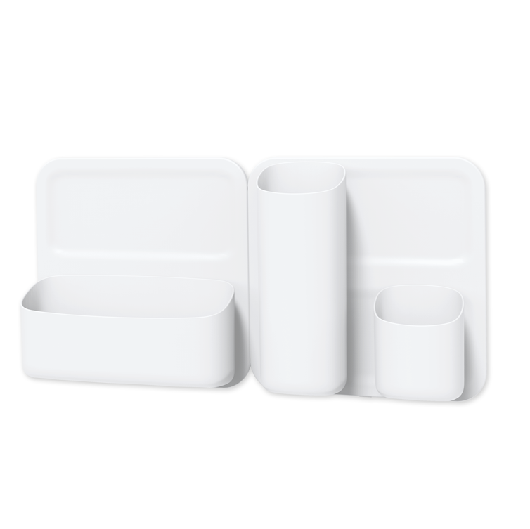
The house shaped chalk board is super cute and Xavier drew this amazing robot himself! The desk is from IKEA and stools are these wooden stools from the play table we used with our children’s playhouse a few years ago. They are now painted white. We love how versatile the magnetic wall sorter (on the left wall above) is and Xavier loves to change up what he keeps in here regularly.
“I love using practical items like this calendar block to teach little ones every day concepts such as the days and months of the year.”
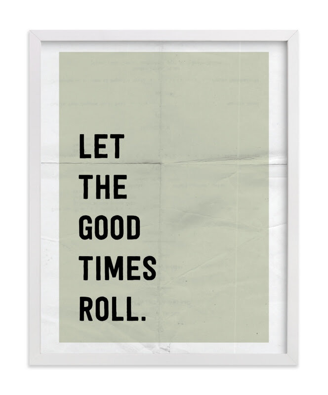
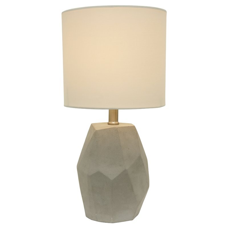
I knew we wanted a good size dresser and one that could last from now until his teen years (if not first apartment!) and this solid dresser is well built and holds a lot. I was trying to decide between a mirror or art and since there wasn’t a lot of space on the other walls for art, it made sense to put a little gallery wall above the dresser for fun here. The sweet sun print is by Emzi Art Shop, the robot print can be found here and the ‘Let the Good Times Roll’ print is from Minted. We decided to put a nightlight bulb in the concrete lamp on the dresser to use for night time but when Xavier gets a little older, we will likely put a wall sconce on the wall next to his bed. So far this solution has worked well so that when it’s time for lights out, he doesn’t just flick the light back on again.
SHOP THE LOOK…
One thing that has added so much softness (and blocks out nearly all the outdoor light!) is the roman shade from Tonic Living. This shade was custom made for the space and is a snug fit on a very basic window. I decided on an inside mount but could have just as easily gone for an outside mount on this wall too. It adds so much softness to the room and the colour (Tuscany Linen, Oatmeal Slub) is the perfect neutral.
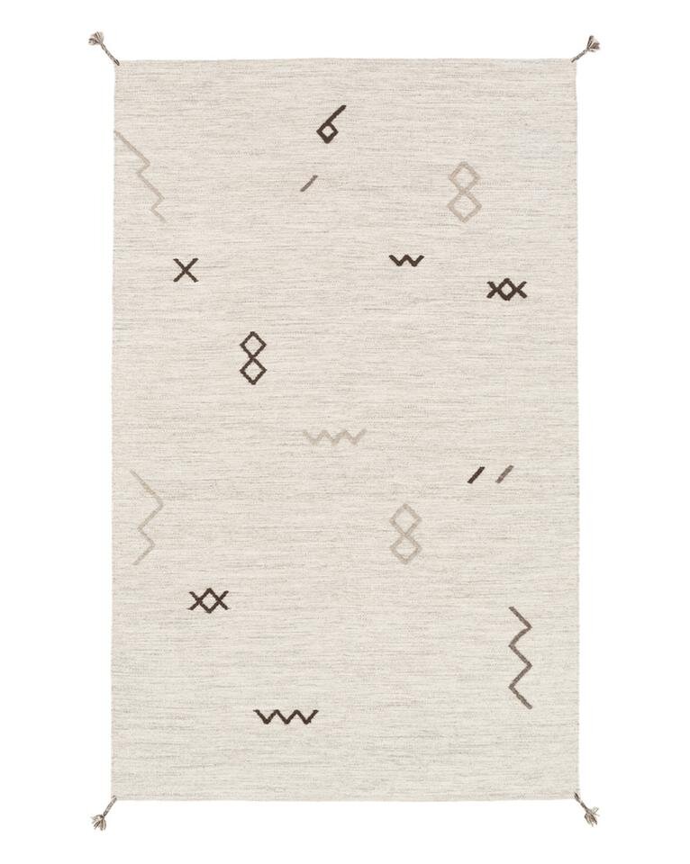
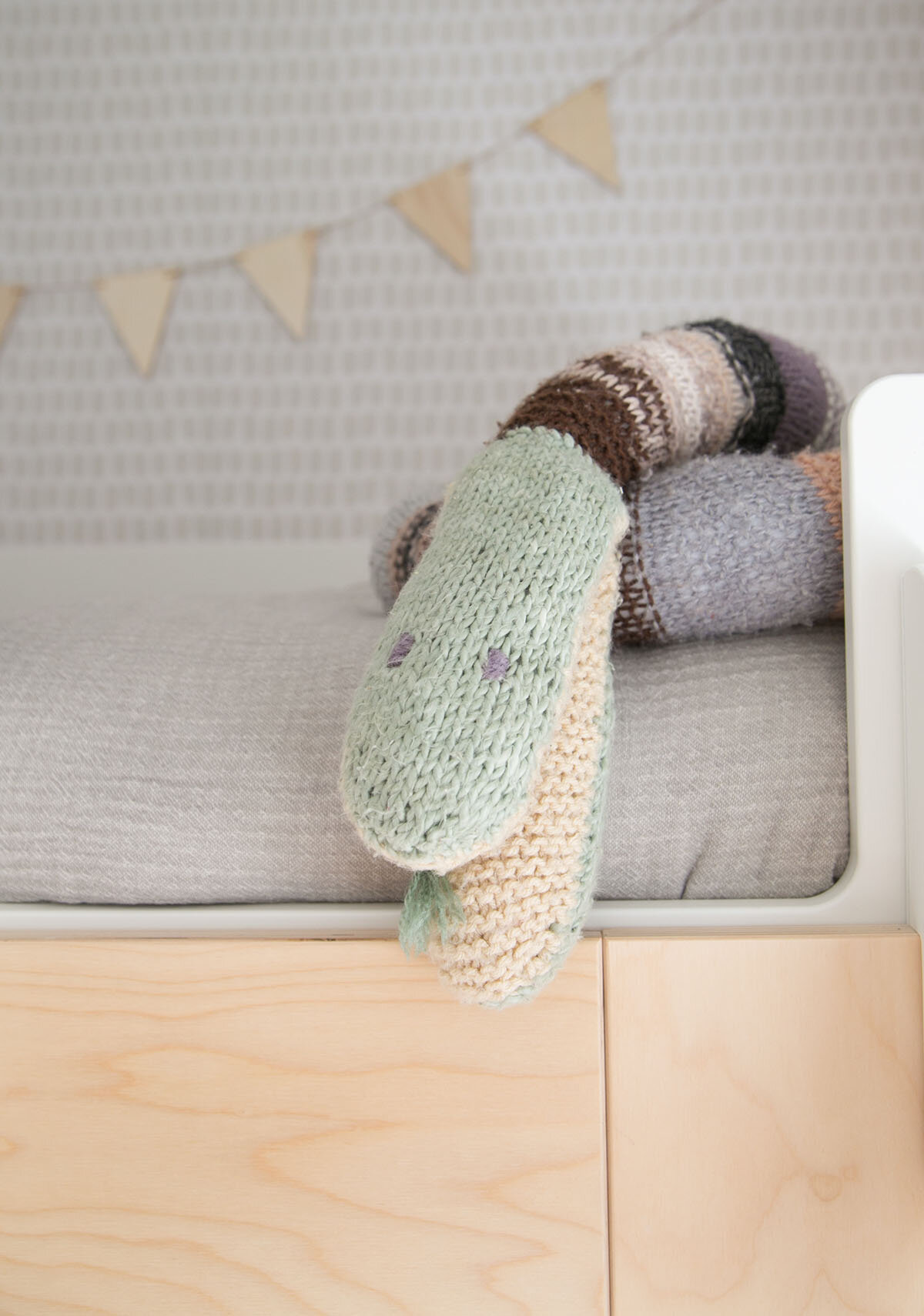
You know how much I love a good book wall and this area with the acrylic shelves creates a pretty cool vignette where you can rotate books just like art. The rug adds a cozy place on the floor to play and is soft underfoot for a wool rug. The knitted snake was handmade by Nana and is a firm fave that we treasure.
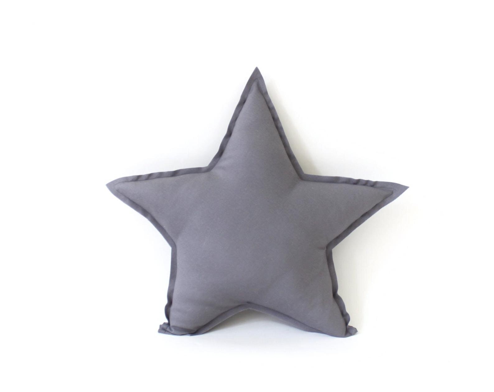
From the hallway, you have this view of the room and I think it’s one of my favourite views! I love catching glimpses of Xavier sitting at his desk or reading a book on his giant floor pillow from Natti Natti which is handmade in Brooklyn, New York.
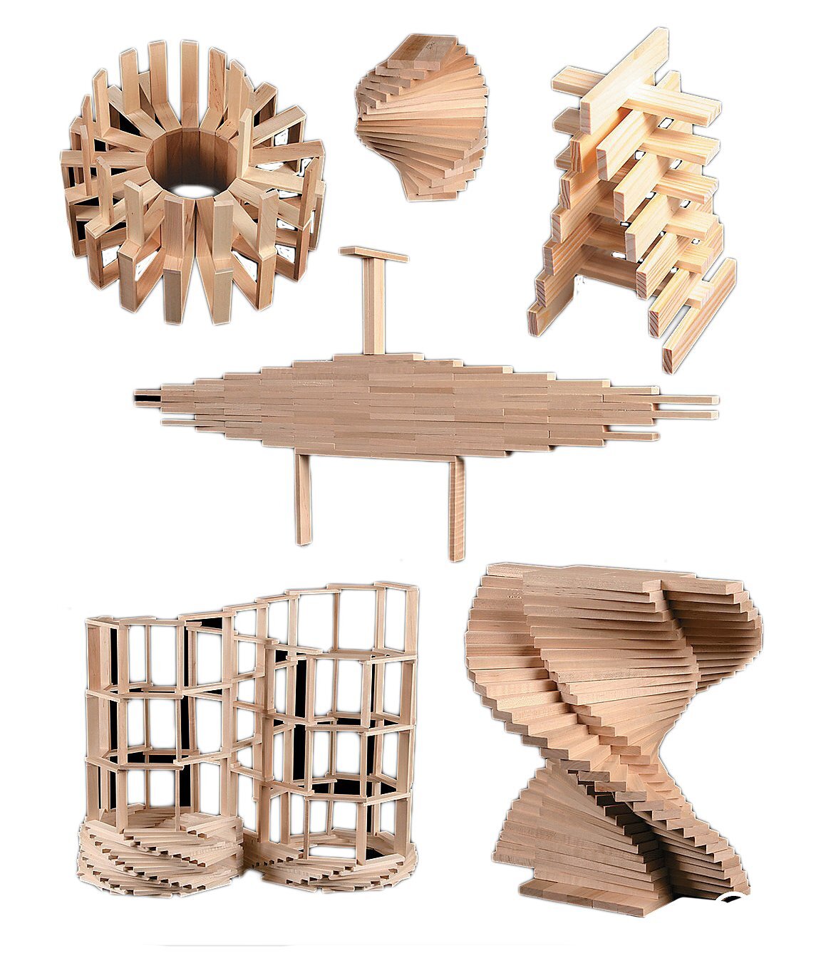
The gorgeous bed linens are 100% linen and from new Canadian brand Dreams Jumper. You can also spot our favourite Cuddle and Kind dolls and Keva building planks.
SHOP THE LOOK…
Although this home is an interim rental for our family, I hope the memories that we make in here will last forever.
*Thank you to many of the brands listed in this post for their collaboration in this project.
YOU MIGHT LIKE THESE POSTS TOO…
HELLO!
WINTER DAISY was created when Melissa Barling was laying on the couch while pregnant with twins. She dreamed of a beautiful baby room but couldn't get up and make it happen. The babies were born and in those mid night wakes and early morning feeds, she decided to leave her corporate job to start a design studio + blog. Welcome to WINTER DAISY.
Follow along on Instagram
POPULAR POSTS...
CATEGORIES
- BOOKS WE LOVE
- BOYS ROOMS
- DESIGN TIPS
- DIGITAL
- DIYs
- EFFICIENT MAMA
- FAVOURITE FINDS
- FREE PRINTABLES
- GARDENING WITH KIDS
- GIRLS ROOMS
- GIVEAWAYS
- HELLO
- HOLIDAY
- HOMESCHOOL SPACES
- HOW TO...
- I'M MELISSA
- INSPIRATION
- KID STYLE
- KIDS ROOMS
- MINI GATHERINGS
- MY FAMILY
- NURSERIES
- OH MONDAY!
- ORGANIZATION
- PICKS
- PLAYROOMS
- RECIPES
- RENTAL HOUSE
- RENTAL HOUSE #1
- RENTAL HOUSE #2
- RENTAL HOUSE #3
- REVIEWS
- ROUNDUPS
- SHARED ROOMS
- SHOPPING
- SHOPS WE LOVE
- STYLING
- TODDLER ROOMS
- TRENDS
- gift guide
SUBSCRIBE
Disclosure
WINTER DAISY BLOG contains affiliate links as well as advertising banners. I may receive a small commission on purchases made through links from this site. The content is always reflective of items, things and experiences that I genuinely like and I only work with companies whose aesthetic is in line with the WINTER DAISY brand.
Sponsored posts will always be clearly disclosed.

